

Top 5 web and mobile design trends in 2023
DESIGN
As we enter the month of April, many UX or web designers start planning their web pages and user interface design for later this year. The focus is always on new features and functionality, but one thing that often gets overlooked during these meetings is design.
As more consumers rely on mobile devices for online shopping, businesses must ensure they have a strong visual brand identity across all platforms.
What are the basic things to remember about design trends?
The basics of good web and UI design haven't changed much over the last couple of decades – clean layouts, legible typography, intuitive navigation, responsive design, etc., are all fundamentals that continue to hold true today.
However, there's no denying that we're seeing more websites adopting unique design approaches that break away from the traditional norms.In this article, we’ve compiled the top five web design trends that we hope to see emerge this year.
These latest web design trends are worth keeping your eye on, as they can help you stay ahead of the curve when you planning to create websites.
1. Maximalism
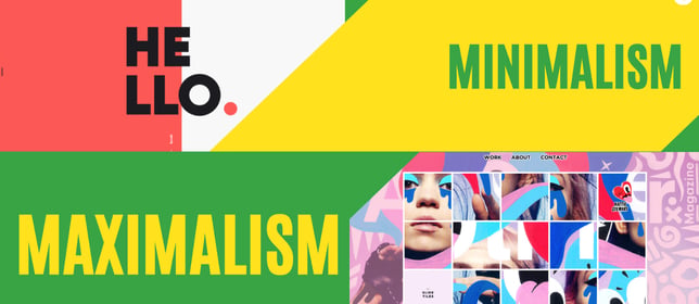
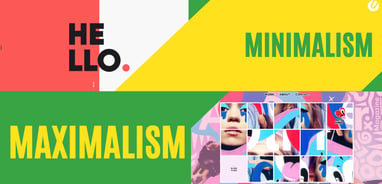
In the past few years, the clean minimalist graphic design was the burning web design trend. Millennials are more excited by maximalism in web design than by minimalism in general (1). Maximalism, in a simple way, is an emerging trend that focuses on adding lots of things to your website.
You add some interactive fonts, another micro animation, some custom illustrations, some small animations, fill it with drop-down menus, etc. This adds variety, makes the page visually appealing, and creates a sense of fun. This "messy" approach doesn't mean that it's not organized; just the right amount of chaos. Your web design can feel chaotic because of its abundance, but if done right, it could be quite elegant and stylish.
According to research conducted among millennial users, there was a significant difference between those who had an affinity for minimalist web designs and those who preferred more expressive designs. Millennials tend to prefer bolder colour schemes over muted colors, larger typography, and imagery that conveys emotion rather than information alone.
Landing pages are great places to experiment with the concept of maximalism. A landing page is usually designed to convert visitors into customers. Therefore, it must stand out from other sites and make a lasting impression. Landing pages work best with large hero image banners, high-quality videos, and colourful infographics.
Maximalist web designs aren't necessarily better than minimalistic ones, although they might be useful in certain situations. A minimalist design approach can benefit technical drawings, charts, diagrams, and graphs. On the other hand, creative agencies may want to consider a more playful and dynamic aesthetic to appeal to younger audiences.
In practice, this means that while minimalistic websites may still work for certain brands, maximalist designs offer better engagement rates amongst millennials website visitors. If your business targets younger demographics, you should consider using a maximalist layout for your website.
Web design, like any industry, constantly evolves thanks to technological advancements and changing consumer preferences. While the principles behind good web design remain consistent, the ways in which designers implement these strategies evolve accordingly. In addition, web designers must adapt his or her own personal style to match the tastes of their clients' target markets.
2. Data-driven storytelling
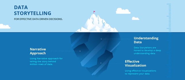
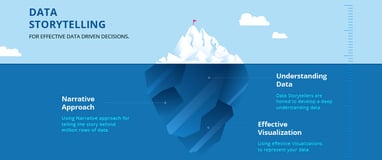
Data visualisation continues to grow in prominence among web designers. While infographics are certainly not new, there seems to be a renewed interest in incorporating data visualisations into the design process. This trend isn't limited to just graphic designers either; web developers are starting to use data visualisations as part of their own workflow, creating tools like D3.js and d3viz.org to make it easier for other designers and developers to integrate them into their projects.
Deep neural networks have been shown to be effective at extracting patterns from large datasets and could therefore serve as valuable resources for designing data visualizations. Designers can take advantage of these capabilities by training a model to extract meaningful insights from their data sets before presenting them in a visual format.
For example, a designer might want to showcase a product's sales history and how it compares against similar products in the same category. By feeding a machine learning algorithm with historical data about previous sales figures for various competitors' products, the system can determine what factors impact sales performance and predict future trends based on that information. Hence, the designer would know exactly which metrics to highlight to convey a convincing narrative to the reader.
As for the graphic element, the possibilities are endless. From line art to vector graphics, the choice depends entirely on purpose and desired outcome of the visualization. UI trends such as flat design and gender-neutral design are especially conducive to data visualization, allowing designers to easily incorporate interactive elements into their workflows without having to worry too much about the aesthetics of each individual component.
3. Single-page scrolling sites
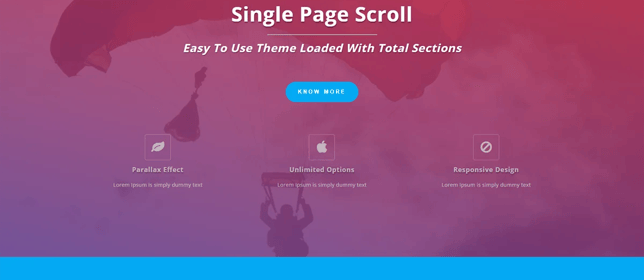
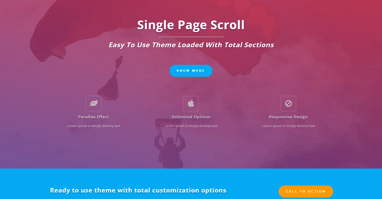
Sometimes, less really is more. With the rise of mobile browsing, single-page scrollable websites have become increasingly popular due to their ability to fit onto smaller screens without sacrificing usability. It saves time loading multiple pages, reduces load times, and allows users to access relevant sections of the site more efficiently.
These sites usually contain a main navigation menu at the bottom of the screen, allowing website visitors to easily find the section of the page that interests them most. It works like a physical flyer; you flip through it until you reach the desired section. Some designers even choose to omit the header completely, opting instead to show off the full width of the webpage.
This trend has evolved beyond its origins, however, and is beginning to incorporate parallax effects, video backgrounds, animated transitions and other interactive elements. This gives the overall experience a more immersive feel, encouraging viewers to stick around longer and engage further with the website.Mobile users should benefit from this type of design since they won't lose track of the page after they've scrolled down, as they do when they navigate between separate pages.
A moving film portfolio reel is a great example of a single page scrolling website. The user scrolls left to right along the timeline, watching snippets of films shot by different directors. Each snippet contains a thumbnail, title, and description of the scene being showcased, followed by a call to action button inviting the viewer to watch the entire piece.
One page websites are particularly beneficial for ecommerce stores. Since the landing page already serves as the home page, there's little point in creating additional sub-pages that only house specific categories. Instead, a store owner could simply include dropdown menus under the primary navigation bar to allow shoppers to filter items according to their preferences.
4. Bold typography
We have come a long way since the days of Times New Roman, Comic Sans, Arial, Helvetica Neue, and Verdana. Modern fonts are becoming more sophisticated, offering increased flexibility and versatility for both web pages and print usage. From serif typefaces to sans-serif ones, there are countless options available to suit every taste.
Larger font sizes allow designers to communicate messages effectively with fewer images, especially for headlines. Using bold typography in the title tag increases the clickthrough rate, whereas using a small font size results in higher bounce rates. For best effect, try combining different types of font families together, such as serif and sans-serif fonts, or script and geometric.
Font pairing is also essential for achieving optimal readability. Combining two contrasting fonts may lead to confusion, so keep it simple! As a web designer, you must be careful not to put too many competing colours in the background, as this can cause contrast issues. Instead, opt for neutral shades of gray, white, black, or blue.
Design elements such as colour and texture play a big role in determining the personality of your website. User interface design is evolving rapidly, giving us plenty of room for experimentation in our work. Bold typographical choices give a website a distinctive voice and can set you apart from other brands in your niche.
5. Gender neutral web design

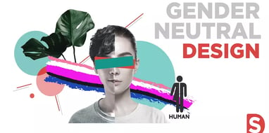
It's no secret that the world has changed dramatically in recent decades, particularly in terms of gender equality. Many people believe that society has moved forward enough that men and women shouldn't be treated differently when it comes to advertising campaigns, job opportunities, and marketing materials.
Design elements aimed specifically toward single-gender customers are slowly disappearing, replaced with genderless aesthetics that appeal equally to everyone. Even though this trend is relatively new compared to others listed here, I think we'll begin to see more and more website adopting a non-gendered approach in the coming months.
Gender neutrality is not only beneficial for companies looking to attract a wider customer base, but also presents an opportunity for designers to express themselves creatively. After all, why limit yourself to masculine or feminine design conventions? It is entirely possible to create stunning designs that feature equal representation across genders without having to resort to stereotypes.
UI trends such as flat design and material design are ideal platforms for implementing a gender-neutral approach because they're clean and easy to understand regardless of the target demographic. Text elements should ideally be written in clear and concise language, avoiding slang words or colloquialisms that can sometimes imply a particular gender. A unique brand identity should always be emphasised above anything else, so don't forget to add subtle details such as icons, logos, and colour palettes that reflect the company's culture.
Build your dream website